Role
Audio Visual Designer
Timeline
4 weeks
Tools
After Effects, Touch Designer
Type
Class Project
Shifting context
Audio Visual Designer
4 weeks
After Effects, Touch Designer
Class Project
Final version
This installation presents the same climate protest through two opposing news perspectives, showing how framing changes the meaning of an event. Both presenters talk at the same time, which creates confusion and forces the viewer to actively pick apart what is being said.
Through projection, sound, and designed text, the piece switches between viewpoints and overlaps them, making the contrast between the narratives even stronger. It explores how easily context can be distorted, and how the same event can feel completely different depending on how it is presented.
The main challenge was making two conflicting news narratives play at the same time without it turning into complete chaos. It was difficult to keep it understandable while still letting the overlap create confusion on purpose. Another challenge was making sure both perspectives felt equally strong, so neither side felt like it was just background noise.
I worked with careful timing and layering so the overlap still had structure. I used volume shifts and spacing in the audio so certain parts come forward while others sit behind it, instead of everything clashing at once. The designed text also helped guide the viewer through the chaos, so even when it feels overwhelming, the core contrast between the two viewpoints still comes through.
I wanted to clearly separate the two news channels, so each presenter has a completely different visual style. One is bald with glasses, and the other has hair and doesn't use glasses.
Making the texts for both presenters was quite a challenge. Framing the story in different ways wasn’t the hard part, but I also wanted the words to overlap and clash at the same time. I managed to get some overlap working, but timing the contrasting parts properly didn’t really work out. In the end I decided to let them come in at different times to keep it readable.
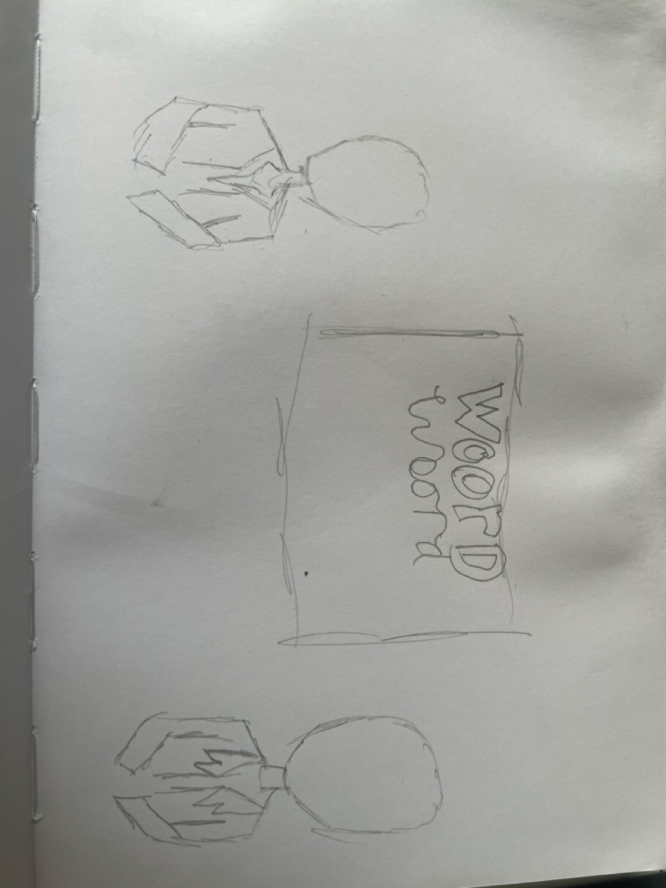
Sketches
For the text design, I didn’t want to make one side look “good” and the other “bad.” Instead, I focused on how each one communicates its message. The anti-protest perspective is bold and red to feel more aggressive and direct, while the other side is green and not fully capitalized, which makes it feel calmer and more neutral.